
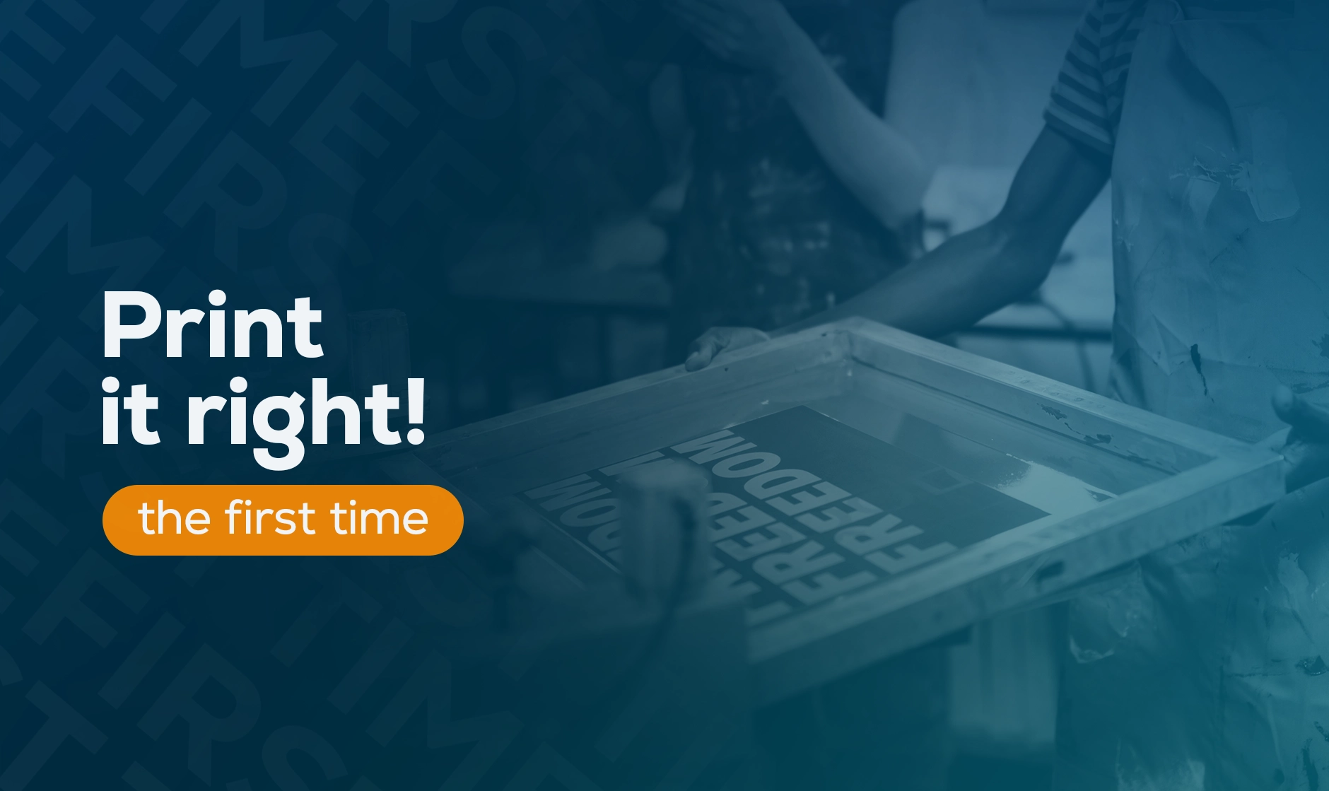

Printed graphics play a huge role in any exhibition, trade fair, conference, basically any event you can think of. Whether it’s a flyer, a roll-up banner or a backdrop, the quality makes all the difference between “oh, they just DIY’d it” and “Nice, let’s steal that.”
But when it comes to actually printing them… Well, that’s where things can get a little tricky. Suddenly your images make you wonder if you need glasses, the text you obsessed over for hours appears in a completely different font and gets partly cut off. And let’s not even talk about the vibrant orange badge you added last minute that now looks like a grey-brown muddy puddle. At that point, print can really make you question your sanity.
The good news is that you don’t need magic to avoid all of this. You mostly need a good understanding of print specs, the ability to communicate clearly with your printer, and a habit of designing within print constraints. Let me help you with the first one and walk you through the most important print specs.
Every printed piece comes with practical limitations, no matter how big or small it is. Large print formats like backdrop walls, banners or panels are often installed into frames or systems that slightly reduce the visible area. Smaller formats such as flyers, folders or posters are trimmed after printing.
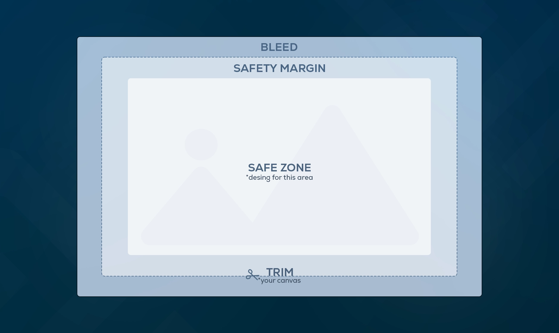
Because of this, it’s important to understand the difference between the final visible size and the required print size, including bleed, trimming and a bit of extra room for fitting. If you design without these in mind, parts of your artwork can disappear into a frame, such as in modular or framed prints. Your logo can end up uncomfortably close to the edge, or your flyers can suddenly have a thin white line around them that you’ll try to cut off at the last minute before the event (and it will show… unless you own a proper paper cutter).
Most printers and stand builders provide technical drawings and print specifications that explain these constraints. If they don’t, ask for them. Many printers even offer ready-made templates you can design in directly, without worrying about file settings (yay)!
Print specifications can sound technical and intimidating, but if you take them one by one, they are not that complicated.
DPI (dots per inch) describes how much detail an image contains. It is the difference between a soft, blurry image (too low dpi) and a sharp one. For small formats such as flyers, brochures or A4 posters, 300 DPI at final size is standard. For large-format prints like banners, walls or signage that are viewed from a distance, 150 DPI is often enough. The larger the format, the lower the DPI can be without a visible loss in quality. Keep in mind that the material can affect perceived sharpness. For example, textured paper or fabric banners may require slightly higher DPI to appear sharp, while smooth vinyl or PVC can look crisp even at lower DPI.
If you cannot see a DPI value for vector files like .svg, .ai or vector PDFs, don’t panic. That is completely normal. Vectors do not use DPI because they scale almost infinitely without losing quality. This makes them ideal for large-format print (my personal heroes of print).
Bleed is the extra space you add around your artboard or canvas. This area will be trimmed away, so nothing important should be placed there. Printers usually cannot print edge to edge on paper or fabric, so small white edges appear that are cut off after printing. Bleed makes sure those edges are removed and do not show on your final print.
Bleed requirements can change depending on material and finishing. For example, fabric banners may need extra bleed for hemming, while paper prints usually follow standard 3 to 5 mm for small items. For larger prints, it can be 10 to 20 mm or more. This always depends on the printer and the finishing method, so it helps to ask your printer or check their templates and specifications.
Margins and safe zones are the inner spacing where you keep all important content like logos, headlines and key visuals. They exist for the same reason as bleed. When the printer trims the edges, a small part of the design can be cut off. To make sure nothing important is affected, you keep it inside the safe zone.
For small formats, safe zones are often around 5 to 10 mm. For large prints, they can increase to 20 mm or more. Larger formats need bigger safe zones. It helps to confirm this directly with your printer or check the printer’s website.
When you create a new file, you can choose its colour mode. Most design software offers two main options, RGB and CMYK.
RGB is for screens. If you leave your file in RGB, printed colours may look dull, washed out, muddy or just… wrong. This is because printers cannot reproduce the brightness and glow of screen colours.
CMYK is for print. Designing in CMYK gives you a much better idea of how your colours will appear on the final print. Even so, slight differences between screen and print can occur, because every monitor displays colours differently. Printing a small sample, especially for large formats, helps ensure the colours feel right. Keep in mind that CMYK is never 100% precise. Colours can shift depending on the material and each printer’s ink mix.
There is also the Pantone system, which uses specially mixed inks for very precise colour matching. Pantone is useful for brands that need strict colour consistency, but it is more expensive and usually requires physical Pantone swatch books (quite pricey).
Not all printers reproduce colours the same way. Offset printing and digital printing use different processes, which can affect how CMYK or Pantone colours appear. Offset presses are ideal for large runs with consistent colours, while digital printers may produce slightly different shades, especially for bright or saturated tones.
Colours can also vary depending on the material. A bright orange on glossy paper may look different on matte fabric or PVC. If exact colour matching is critical, ask your printer which process they will use, and if possible, request a small proof on the same material.
Some printers may also request a specific colour profile, such as ISO Coated v2 (usually you can find them in the export settings). Using the requested profile ensures your colours behave as predictably as possible once they reach the printer.
Print-ready PDFs are the safest and most widely accepted format. They preserve layout, colours and scale when opened on different systems. Printers may accept other formats (usually indicated on their website), but PDFs are the most reliable choice.
Clear file naming prevents confusion, especially when multiple versions exist. Instead of labels like “final” or “latest,” using dates shows immediately which file is the most recent. It also helps to refer to the exact file name when communicating with your printer. You can even include the time if you make several updates in one day. A name like EventName_Banner_2000x1000_2025-06-12.pdf may not look pretty, but it is clear, searchable, and leaves no room for ambiguity.
Having a clear, step-by-step print process will help you stay on track and avoid stress.
Start by confirming sizes, visible areas, and required specs with your printer or builder. If you are working with a stand builder, you can also request technical drawings showing height, width, visible areas, and panel joins. Then, set up your document using the correct dimensions, bleed, and margins, and design within those limits.
Before exporting, check image resolution and colour mode. Export a print-ready PDF using the printer’s settings. Review the file carefully and zoom in on text and logos to ensure everything is sharp. A helpful tip is to test print your design on an A4 sheet at home or in the office. This can reveal issues with layout, colours, or typos that you might miss on screen.
Finally, send or upload your design and review the digital proof before printing. For low-cost items or small quantities, this may be a simple digital preview. For high quantities or more expensive prints, it is worth requesting a physical sample. For large-format prints, always ask for a digital proof and an approval step before the final print.
Use this checklist to make sure your files are set up correctly before sending them to your printer or stand builder:
This checklist helps you avoid last-minute surprises and ensures your prints come out exactly as intended.
Tell me what you’re planning, and let’s make it happen.

